Beyond Layers II
Inspirational thoughts and projects hosted by Kim Klassen
Day 18 ~ Beautiful Black and Whites - Tips and Techniques
Kim talked about the types of things to consider for converting an existing photo to black and white. Contrast and light are the key elements. A washed out photo will only present a washed out black and white image. Do the black and white conversion outside the camera rather than using in camera editing. Lines, texture and patterns in the correct light can be quite effective as a black and white.
Kim went over the steps for converting black and white in the camera raw editing in Photoshop as well as the enhace option for black and white.
Move your mouse over the image to see before and after

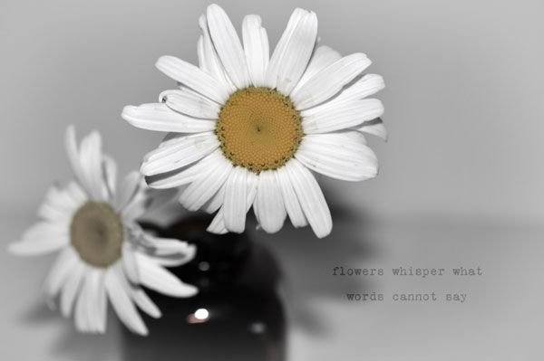
I first chose an image I had done early on in the lessons primarily for the contrast between the white background and dark blue vase. (By moving your mouse over the image you can view the before and after.) After the initial black and white conversion, I darkened areas of the vase and lightened the lavender. I also applied a texture supplied by Kim in multiply then duplicated and applied in soft light blend with opacity adjustments. Wording was added in black then lightened in soft light blend.
I converted the next image to black and white but then decided I actually liked it better with a touch of color pulled back in. This was accomplished in the hue/saturation mode with desaturation. Again, the wording was added in black, then changed to blend mode soft light.
Move our mouse over the image to see before and after
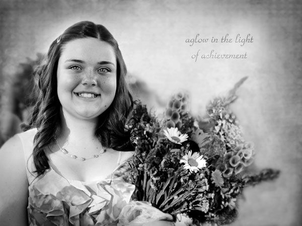
Portraits work well in black and white as it helps bring out detail in the face. I thought this photo of Maddie had a perfect light background to help enunciate the details in the face.
Move your mouse over the image to see before and after
As a side note--the ability to view images in the before and after format is a function that Kim utilizes frequently in her postings. She shared the process with us and after much frustration, I was able to figure it out!
Day 19 ~ Color Week
After several weeks of black and white, it was time to let loose with some color! Kim's British friend Xanthe, who adores color, chimed in with some colored inspiration in the form of a video. We were asked to think bright and dedicate each day to a different color:
- Monday - Green
- Tuesday - Yellow
- Wednesday - Blue
- Thursday - Pink
- Friday - Red
You can click on any of the images to see them in larger size. Click to the side of the image to return to regular size.
Monday

Tuesday

Wednesday

Thursday

I had also worked this image of the garden gate which I originally wanted to use as part of the collage. I was never ablet to fit it in to my liking so posted it separately as a Pop of Pink

My favorite of the week was the last collage done in reds.
Friday

No comments:
Post a Comment